In this panel two rough copy, I decided to design something crazy on my second panel and create awesome unique shapes to me. On my other panel its pretty simple and shapes are basic. This is only the start and rough drawing of my second panel, I really hope to see that this can come to life and bring an amazing piece of artwork to my kaupapa and design.
In this design port folio, we can see the colours and the design of each piece fits together in groups. We circle them in groups to see how they fit together and how they come together when they are spread out all over the two panels. What I mean by that is that some of the groups are put all over the place but relate to each other, like having to relate one group of the t shirts with the group on the top right of the panel.
Looking at this artwork we see that this artwork relates to time, because there are clocks being placed everywhere but they are melting. This artwork includes some warm colours and some smooth texture, the colour that is used the most is brown, with a bit of gradient and fading, slightly changing the colour brighter or darker. The setting is placed in a desert by the looks of it, because the artwork doesn’t show a clear background of where the location is but just a smooth, unreal painting of the background. There is this white looking animal that is lying down on the ground, I don’t really know what it's supposed to be or mean, but it almost looks like a horse. There also is a branch holding one of the three melting clocks showing that there is a little bit of environmental in this art piece, there is a cliff in the background with the sun light touching it, and the paintings in front having dark colours, showing that there is shade and something to blocking the sun from touching it.
A Brief is your ‘WHY’ - the reason you are making art. It will help direct your thinking and give you the core details of your design project. Essentially, you need to start with a brand or a business and go from there.
What is a brief? A brief is something that is short but explains something straight to the point.
Why do you need one? Instead of designing something large or something you don’t understand, in a creative brief you have to clearly see what the design is and justify its benefits, and also planning how you will get the attention of your audience.
Answer these Key Questions:
What is your Brand or Business? Raising Awareness Design
What is the Purpose of your Brand or Business? Raising awareness of what could go wrong if you continue to do something that could change the way they live into a bad behaviour, like phone addiction could ruin your life, lack of family time can lose love and support when needed etc.
Who is your Target Audience? 14 - 21 years of age (Both females and males)
For this Business that I want to create, I've decided to design something that includes awareness. I was thinking of doing something that has something to do with phone addiction and how bad it could effect our well-being, our relationship with family and friends, and how it could effect our brains while we are on our phones and after we get off them. I am targeting the audience from ages 14 - 21, because at teenage times you would need, want and always be on your phone to chat with others across different social media platforms. As a child under the age of 14, they would want to play more outdoors and not much on phones, and for adults over 21, they will have jobs and different things to focus on instead of being on their phones all the time. I am not saying the these specific ages I chose for this awareness don't do outdoors, but there are about 95% of teens who have access to smartphones, and 50% of teenagers feel addicted.
The colour palette I chose to start using for my logo development is a technique of complementary colours, which are both red and green.
For this digital mood board, I have chosen to do Design for Level 2 this year, and so I am looking to for design artist and finding out their artwork design title and date that they have published them. There are 11 artist to find and discover their artwork, there are 3 categories of themes that they are in, traditional, contemporary and Aotearoa. My kaupapa this year will be Cityscape.
My brainstorm or thoughts of what each theme means.
Spiritual and cultural - This theme is about culture, and defining about a culture, by seeing what they do, why they do it, and their artworks and explaining what is behind the piece.
Environment - This theme is about planet earth, basically our environment, what we see around us, the grass, trees, buildings and everything is counted as our environment, and we learn about why we should protect it, and what happens if we don't protect it.
Cityscape - This theme I believe is about the city, when you go in the middle of Christchurch we would see buildings, and we see lights and huge artworks of buildings. I love view like this when reaching the top of the hills and seeing the city, its so beautiful, and I would really love to share artwork about it, that is why I chose this theme.
Equality - I believe equality is about us humans, what we share about each other, how each and one of us should be treated for the way we are and how we want to be.
This visual text is going to be film poster. I based my static image on the film series "Money Heist". The images I used to create this poster are characters from the film, their costumes they use, and also raining money, showing what they are trying to complete getting, throughout this film. The colours that you mainly see are black and red, this helps show what is happening in this poster and throughout the movie. The colour red represents, war, danger, love, desire, strength, hate, anger etc. As what the quote has been said, "Love is a good reason for everything to fall apart" on the top left, two people are in a relationship during the crisis on the heist together with the whole crew, they get so distracted that then the plan did tend to fall apart, for it shows on the top right picture, where then one member from their crew get captured into a scary situation.
As said, the verbal feature I used was a quote being said in the movie from the female character on the top left, saying "In the end, love is a good reason for everything to fall apart". The font used gives are very good tone to the poster, it communicates well with the images which show very dark features from the movie. The colours red and black have been used very effectively to give dark vibes to the audience and to show meaning without much explanation, by this I mean, the colours talk for itself to show what they are pointing out throughout this poster in the film, and to give the quote a good meaning in this poster, and make the image look effective.
The type of visual text I am going to create is ... Poster on google drawings
I am going to base my static image on ... Money Heist
The images I am going to use are… Money, Red costume worn with mask, weapons, red lightning.
I am going to use these images because… it relates to the movie, they want to steal money but they play it without revealing their faces
The verbal feature I am going to use is … “In the end, love is a good reason for everything to fall apart”
Movie Description:
A criminal mastermind who goes by "The Professor" has a plan to pull off the biggest heist in recorded history -- to print billions of euros in the Royal Mint of Spain.To help him carry out the ambitious plan, he recruits eight people with certain abilities and who have nothing to lose.The group of thieves take hostages to aid in their negotiations with the authorities, who strategize to come up with a way to capture The Professor. As more time elapses, the robbers prepare for a showdown with the police.
My Kaupapa for these individual different painting and layout, is identity. This first image is a cut piece from cardboard, and painted to show the 3D of my painting that are below. The second image is a painting of what I want to do in 3D but what you see in it is cold colours that I used to express the texture of what the colour is showing to create this human piece. The third image is also the repeated copy of the second image, but in warm colour, it creates a warm, messy and beautiful look and gives you a bright type of vibe.
What is working? - What is working is that on the first image I used cold colour on the folded legs, and I used the warm colour on the upper part of the body. Everything tends to look good together, putting together a piece of cold and warm coloured pieces.
What is not working? - The oval pieces, known as the hands and feet, I don't think would go together well when put together with the entire piece.
What is my next step? - To try think it out with the colour of the hands and feet, and also try workout the colour for the face/mask.
I want to add a bucket hat with dripping paint coming out of it to create colour effects on the mask with a bit of warm and cold colour, but then I feel like it would be too much on everything. Everything is coming together well so far though, I love how the colours mixed well together but making two colours show.
In this essay we will discuss how mobile phone’s control people’s lives. Mobile phones are one of the worlds one thing that can control a person’s life, they can distract you from family and friends, they tend to build addiction in someone, they tend to cause accidents and injuries, etc. For every 100 hours you use by talking on your phone, you suddenly increase the possibility of brain cancer by as much as 5%. Phone addiction can provide resistance in social life. Phone addiction can lead to living life through phones.
Most people can’t survive one day without their phones, and that is a huge problem to people’s brains and relationships. People browse the web, text, call, watch videos, etc. almost every hour which doesn’t give them time to rest and they tend to forget to eat and drink. People can stay up overnight and not get any rest due to addiction on their phones and blue light conditions to the eyes of humans that can cause no sleep. An effective way to stop people from having huge addictions to their phones, is to do exactly nothing and to daydream about things that you wish to happen in your life.
75% of people can’t resist staying away from their phones from a limit of 5 feet away, what they need to do is take time apart from their phones and make yourself feel useful and enjoy the world. People tend to rather spend time on their phones than spending time with their family and friends. 25% of the people can do this quite oftenly; they know when to have their phones and when to not. Some people may keep their phones with them just for an emergency or in need for an emergency, but that doesn’t answer a question of why they are addicted to their phones. To decrease the number of people who can’t keep distance from their phones, you need to know that it is simple to do this and finally make yourself useful and do some chores.
Usually, people take time to spend with family; parents tend to apply rules, most mainly they allow no phones for distraction. This is what causes anger and stress to arise in people, mainly Teenagers. Kids and Young adults, are most certainly the age limit who lose self control when not having phones with them or when taken away from them, they tend to complain in the middle of something, or they would be mad all throughout because they won’t have something they are addicted to. People are still young and they find it hard to learn how to lose addiction, mainly to phones, but it's still possible. This can help increase the time of rest during the night and can grow more time with loved ones. Having rules in your household for phones is manageable to decrease the amount of distraction to your brain and to yourself with social media.
Many car accidents are due to cell phones. Phone addiction is considered a disability. Approximately 660,000 drivers attempt to use their phones while taking hold of the wheel. There are ways to prevent this from happening; putting your phones on silent, completely turning off your phone, putting your phone out of reach or to really know the law and know you shouldn’t be having them out. These are ways to prevent car accidents and injuries from happening. It is good to be safe, and you always gotta watch out for what may come your way, especially for whoever may be in the car with you, you got to keep clear on the road and let driving distract you from your phone. These all include some safety methods to try and let driving distract you from your phone, because it’s something to get a hold of and to know about when driving. Nearly 400,000 injuries occur each year from accidents caused by texting while driving, and it may scare a lot of people, to get a clear hold of everything, try to keep families, friends and others safe when driving.
Mobile phones control people’s lives, mobile phones can be seen in classrooms, they can be a helpful tool when in need for help such as calculators, notes and calendars, but they tend to lead to a distraction for themselves and other students. When students use their phones to enter social media, it can lose their learning towards their work in class. This can create disruptions in class, especially when teachers continuously tell students to put away their devices. Me (Joshua Iva) with such a beautiful heart, it's easy for me to recommend NOT TO USE YOUR PHONES IN CLASS WHEN TEACHERS SAY TO “PLEASE PUT AWAY”, thank you, yours sincerely ‘Joshua Iva.’
Few updated work, but work is still in progress...
Colour
This photo (crown) defines the colour purple, it shows a strong meaning of royalty and 3 other strong meaning behind the visual text is wealth, power and wisdom. If this is placed on someone's head it shows that they are worthy to do anything and are to basically to shown respect, and they get to take lead of what they are crowned for, like King, Queen, Prince etc. The colour purple fully shows and symbolises wisdom, luxury, royalty and power.
Symbol
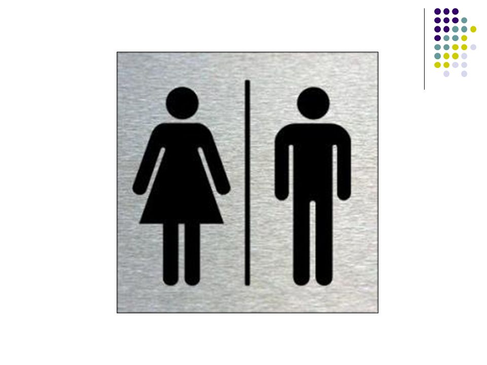
This visual text symbolises gender (male and female). This is most common to be seen in public toilets, the reason being is because there places where females and males have to be separated due to privacy and the way the toilets are set for each gender. Its important to have toilets for two different genders, because it is safe for each other to feel comfortable when in need for privacy. Lets just say if a male was to for whatever reason was to walk in the female bathroom, it would cause the females to argue back and lose confident.
Lines
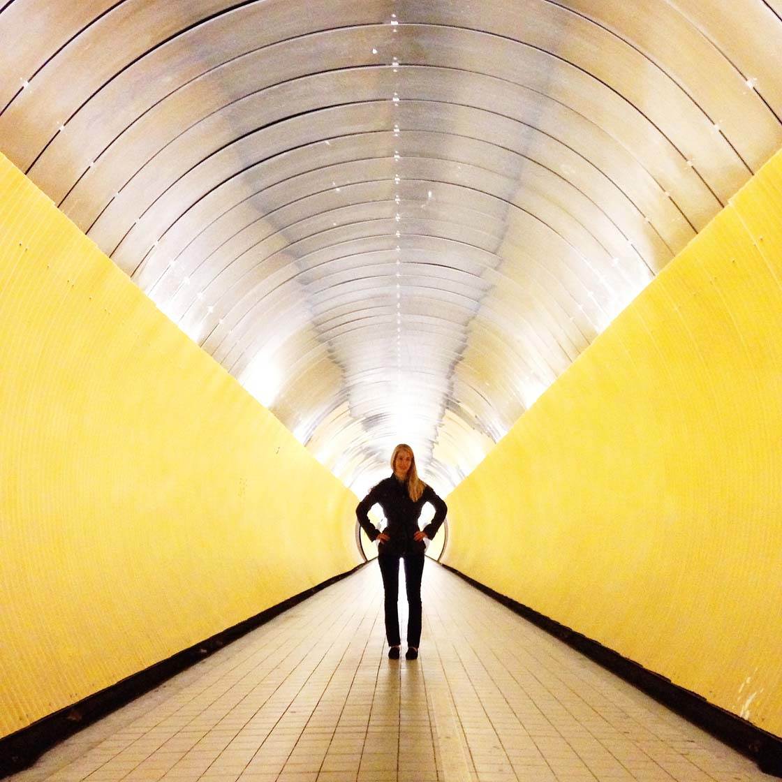
In this image, you can see a person standing in the middle of a tunnel, and what the tunnel is doing it leading its lines to the focal point. Everything in the image all has lines leading to the main part of the photo, the yellow and black lines on the side, and on the floor you see mini squares that have lines leading to the person and also in the ceiling, having a shiny reflection that reflects the floor and the side lines repeating its image that also shows leading lines. This helps shows the meaning behind image and lines, because they draw attention when looking at it, the first thing you would see is the focal point (Main part of the image) and because the help of the lines (Leading lines) it creates a beautiful image showing the techniques of the different static image aspect.
The type of song I am composing is, playing on piano like a slow sad type of mellow, with some singing in it to explain the story.
You working alone or as a group why?
I am working alone because there are some parts where I want to do things by myself and there are something's that suit a solo player and it's so much easier doing solo for I can decide whether I like or not then I can change it.
Which part of the composition are you writing first?
I am writing my lyrics at the moment and figuring out if it suits the part of the piano melody.
What are you working on this week?
This week composition, I am working on to definitely finish the piano melody and the full piano piece, then I will be figuring out the singing tone seeing if it fits in with the piano, then maybe a little of bit of writing the lyrics.
10/08/20
What did I do this week for composing?
This week, I have been focusing on still having to add lyrics, lyrics that go with my theme I am talking about. My theme is talking about someone who ran away, and never turned back home, and the family who owns her started to feel mixed of depressed emotions. I am also focusing on figuring out my tone of voice I will be using to go with the piano sound and lyrics this week.
I chose this song, because this song really suits my voice and it wasn't too low and too high.
Are you happy with your final performance of it?
Yes, I am really happy with my final performance, everything turned out the way I loved it to when I began to watch the video of my piece. I am really proud of myself and my singing teacher for helping me throughout finding this song and practising it.
What did you find challenging about this piece?
What I found challenging was working out my stage presence for this song, because it is a depressing song and it needs a bit of emotional movements.
Performance goal for Solo 2 (What are you going to work at improving?)
Try and look up at the audience because I would always be looking down whilst singing. I also need to work on stage presence and being brave for my next performance.
For my artwork piece, I am working on my chosen kaupapa, Humans and the Environment.
In this image shown above, we seeing the upper body of the structure I am building, leading onto a 3D cardboard structure. I am starting off by working on paper to figure out the look I want and the colour I may apply on it.
I love how this is turning out, the colours bring together a lovely piece of artwork to me, it is filled with so much colour and it work altogether to bring attention to if possibly seen on the streets or so.
What is working:
What is working is that the mixture of colour for this specific type of artwork is coming together and bonding well, making an old fashioned type artwork and blending together with some future bright colour.
What is not working:
What isn't working, is that some other part of this structure's painting isn't very smoothly painted and was not accurate.
What is your next step:
My next step is what this could look like in 3D, I just wanted to paint this to practise and to possibly use this look on the 3D structured piece on cardboard. My next step is painting the entire body and bring to together colour and creation on to what suits the upper body structure.
For this method of art I created, I wanted to use my imagination and create a very advanced art piece.
What is going on in this practise piece is that I am creating steps of a human body with a missing piece in the middle (The stomach). This just shows the technique of negative space, for me I wanted to create something like this because it relates to people with stomach cancer e.g Stan Walker he had stomach cancer and had to go through scary surgeries, I wanted to show art from this disease, not that I'm judging it but because its something to care for and for it being scary, I wanted to create art from it making it beautiful.
What is working?
What is working in this artwork here is that it is coming together the way I want it to look like and it shows a beautiful look with negative space creating something I didn't expect to design.
What is not working?
What isn't working for me is that it is easier drawing it small on a small piece of paper, whereas it could ruin the effect for me applying it on a large piece of design.
What is my next step?
Practise more of these to get the hang of it so it can be easier to make the real version of this on a bigger design for the finish product.
In today's session in Art class, we will be learning how to post blogs and writing clear information about the art we are drawing. We have to explain the background of the artwork and what inspires you about the artwork. It is pretty tricky having to find artwork to draw about and being prepared to explain what it means to you.
This artwork was my favourite to work on, this relates to my chosen theme which is explained to be environmental. The reason why I chose this theme is because I love nature the impact of humanity on its condition, I love when people care for other people and the country and just how they want to travel the world to experience more about it.
During the time when I was painting this tree, I experienced using water colour and learning the techniques on how to make a perfect water colour art piece. I used the complementary colour wheel technique to create the combination of colour, these colours coming together, bond very well with each other creating an amazing colour effects scene showing great life background of a tree, we sometimes see their true colours on the outside, but in the inside they bring true beautiful colours. These trees bring life to the world, they bring colour, art, oxygen and scent making this world a great beautiful place.
In this artwork, I drew a structure of a face built with different varieties of art supplies and art techniques. We have the eyes nose and mouth as normal, I have a magnifying glass creating a eye for the left eye, also have a bucket hat with paint falling out of it spilling on his face and we also have a puzzle piece pulling away.
Just to let you know, I created this with my mind because I'm the man, creative ideas creates a good art piece.
Now with this artwork I drew something that just completely came from my mind. I loved how everything turned out, it definitely turned out the way I didn't expect for it to, but it looks amazing. The first drawing above, I tried to draw a drawing that I wish to see as a structure because it would totally make a good artwork.
The second drawing below, I drew 3 squares which I should have added colour onto, and tried to create a good colour affect using the colour wheel chart with the split complementary affect.
Next I drew a face randomly just to add something to create a focal point, with all the squares creating it leading lines.
Using a combination with wet media and dry media was a pretty cool technique to use and do.
What I had to do was make a portrait to draw from, I created a cylinder and a triangle looking cone.
This was my first time using charcoal in fact willow charcoal. Firstly I had to use wet media, which known as water paint, to create an light colourful effect on the artwork before lightly scraping the charcoal onto the portrait paper.
As you can see I used water colour first, trying to make an effect of leading lines.
I am creating leading lines to make the objects the focal point of the artwork, it didn't worked out as expected but I love the way I tried and how it turned out.
Next I used Willow Charcoal to sketch the shadows of the objects and also darkening the background trying to make everything focus onto one piece of the image.
What was challenging to do in this artwork was trying to line the shadow reflects hoping it would look realistic, and also shaping the objects which is the key to this artwork.
I used an eraser to basically draw the lining of the props, rubbing out the edges so you can see the prop. I moved onto erasing the light touching parts as seen on the props creating a light effect, showing where the light is coming from.
Water painting in art was very interesting to do for there are many ways to create your own art drawing. Of course painting is one thing to easily do during water paint, an interesting thing to do is practising how to make colour fade, what turned out amazing while doing this fade technique was perfectly smoothing the colours out and making light colours without grabbing a whole different bottle to make colours light.
I randomly just drew something in this artwork. I was going to draw a face but sadly mucked up on the buns on her hair. What I did whilst this was ruined, I tried to basically draw mother nature in my own image almost dying from planet earth because of how badly we can treat it.
This artwork I decided to draw a tree because it related to a theme I chose which was environment. I tried to use colours from the complementary colour wheel, basically I tried to fade three different coloured trees to match the wheel colours including the ground and the leaves.
This was very complicated to make, I wanted to mix both the images above drawing my mother nature image and the trees relating to the environment theme. I wanted to make her hair blowing to the left with branches dying for the mess we had made during the last decade. I drew nature on her face, talking about what she wanted the earth to look like and stay like, with the greens tears running down her eyes she is losing blood and is hurt.
To make sure I only drew these images in my own images, these don't have to be true, I just wanted to create art to relate to the chosen theme (Environment).
Statement: Colour were used effectively in the film trailer Limitless. Evidence: We see this from the start of the trailer it was all grey and dark showing his old self, then going to his new self where he liked, colours were bright and colourful. Explanation: This makes the audience feel how wonderful he is feeling now that colour changes, we see how the movie changes instead of us having to know when the feelings will change. Explanation: This was done to show differences of colour and looks so that the movie would make sense for it to start off bad and sometimes end good or the other way around. Explanation: Combined with the music they used for the changes made the film trailer seem more up going, more hype to get us excited for what we could possibly see next. Link: The use of this type of technique can relate to 'The Hunger Games', everything had to start dark and dull before getting into the main part of the movie or getting to the best part of the movie for the colours to get brighter. Statement:Emotions were used strongly in the Kerosene Creek NZ short film. Evidence: For example, the time they were driving to the Creek they were excited and having fun when they got there to swim, later on during the film and before the film while she was having flashbacks her friend died which caused her emotions to change from happy to extremely sad. Explanation: This makes the audience feel the same way, when the movie turns to its dark side people seem to change emotions as well and follows along with the film. Explanation: The director did this to drawer the audience attention to follow along with the movie, and make it seem real or sometimes make them feel like they are in the movie. Explanation:Once again this also works well with the music they used during the deaths of there friends. Sad music and mostly singing to say there goodbyes with sadness. Link:This can also be combined with the movie 'The Hunger Games'. Flashbacks seem to happened again but the other way around. The Hunger Games main character Katniss had flashbacks about how her dad died. Whilst in this movie the girl was having happy vibes flashbacks, emotions were used strongly for they were in good use in this film.
Statement: Camera movement was controlled very well in this film Walk the line. Evidence: We could see this during Johnny Cash's performance whilst drunk, strongly drunk. Explanation: The audience can clearly see how strongly engage he was with drugs and just engages us with whats happening with him. Explanation: The director did this to give us a crazy look on how Johnny was feeling and looking which did kind of gives us a worry about what might happen next because he didn't look like he had control of himself. Explanation: This just worked out well with his acting skills, without his acting skills playing drunk then there wouldn't be any good use of strong camera movement. Link: Taking us back to the top with the trailer of the film 'Limitless' you could see the differences with the controls of the drugs for these two main character. In Limitless the guy took the drug and made him feel more powerful of himself then on this film Johnny Cash felt weak and uncontrollable about himself and we as an audience can see the differences between these two main characters.
Statement: Visual Techniques were used very brilliant in the Meth PSA 'Jessica'. Evidence: We could see this during her bad times, times when she gets raped and times where it showed the sink where she pulls out her eyebrows. Explanation: This just gives an audience a ride throughout the techniques that were used to really make it more this ad more scare. For it is meant to be scary. Explanation: This just shows all the bad things this female cheerleader is going through for the fault of the use of meth. This also gives us a heads up for what bad things you can experience using meth, not all the time you go through this but you could just get into other troubles. Explanation: Combined with the voice over (AKA Narrative I would say) really just focuses us on both senses, hearing and sight. We can clearly hear what he says with all these crazy effects and music which makes everything combine well and we just watch without missing a word, sometimes you can stuff up but its rarely to keep up. Link: All the visual effects that were used to put everything together in this ad reminds me a lot of the movie Avengers Infinity war. Almost at the end of this movie, Thor came, threw his hammer into Thanos the evil guy, and with so much bright features and effects it cuts into Thanos with a bright effect hit. The Meth ad and the movie Avengers put a lot of effects into them to make them seem more realistic and entertaining to watch.